
The O's have had this logo since 2009, & it's a simpler version of their past logos. Personally, I think they should switch to something like this. Maybe a switch to something like that will come in the future. In the past, the O's have used logos like this one with a baseball diamond in the background, but I think that this one looks the best. However, the bird in this logo isn't the one on their cap, so don't be surprised if they switch to something like that in the future.
Boston Red Sox:
 This simplified version of their past logo looks much better. Usually, I love logos that feature the circle around them, for some reason though, I don't like it with this one. Boston finally struck gold with this logo & they shouldn't change it.
Chicago White Sox:
 This is the Sox current sleeve logo, & it looks good. It looks a lot like the Red Sox logo in fact, except that it's white, & inside a diamond. There's not much to say about this logo. Just looks good.
Cleveland Indians:
 Chief Wahoo has been the Indians logo & cap insignia forever. It's a classic. Look throughout most of Cleveland's primary logos & some variation of this one is there. At this time, the Indians are starting to use a new cap insignia. I think this one should remain, because more MLB teams should use symbols on their caps instead of letters.
Detroit Tigers:
 Detroit made a perfect cap insignia, but the only use it on their road caps. If I played for the Tigers I'd wear my road uniform even on home games just to wear this cap. I don't care if I'd get kicked of the team this orange D looks so much better than the plan white one, it's worth it.
Kansas City Royals:
 The Royals have a perfect cap insignia, & luckily they wear it on home & road games. This light blue variant is the best version of it, in my opinion.
LA Angels:
 The Angels have had some pretty bad logos. They were able to rebound, with this one. Used currently as their sleeve patch, it takes the awesome haloed A & puts the circle of greatness around it. Remember kids, if a logo looks good, put a circle with the team's name around it, it always works.
Minnesota Twins:
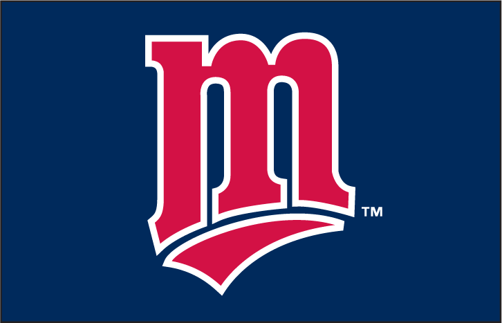 This is a awesome cap insignia, it's a classic, & yet it still has that modern look that makes every logo look better. The way the M is underlined is awesome, & the outline makes it look amazing. Good job.
New York Yankees:
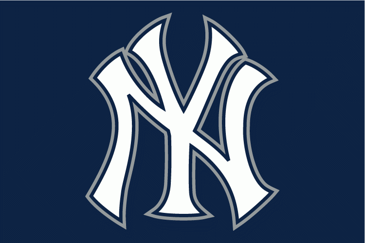 This is a classic. The silver outline, & navy background make the blandness of it disappear. Plus, everyone on Earth thinks this is the best insignia in history, so why not?
Oakland Athletics:
 Another example of the circle making a completely average logo look awesome. I know the circle is very over used, as half the logos in this post have it, but it's just that good. All 30 teams could use it & I'd still love it.
Seattle Mariners:
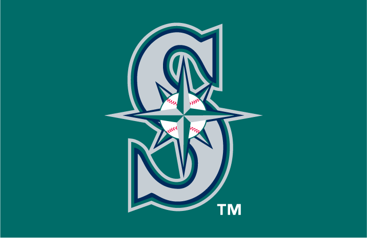 The tealness of this logo is amazing. I've never liked the Mariners little compass thing, but the S makes it work. Kinda.
Tampa Bay Rays:
 This logo was only used in the first two years of the team's existence. It was later replaced with this smoother version. I can understand that switch. This logo had rainbow as it's colors, & having a team's colors as rainbow doesn't work, a team's colors can't be every color. Another reason was the word devil in this logo. The team was the worst team in sports, & a lot of people thought that putting devil in their logos put a curse on them, even though it didn't seem to effect Duke & the New Jersey Devils, they still took it out of all their logos. I can deal with that. Then this new owner comes in with this idea do take devil out of their name officially, making them the Tampa Bay Rays. Okay, why were all the jerseys & logos changed? None of them, at the time, had devil anywhere on them, not the logos, not the jerseys. So why "improve the team's image," by taking devil out of their jerseys & logos, when it wasn't there. Their new logo is generic, & doesn't make sense. The tail on the R makes you think they're sting rays, but the star burst makes you think their rays of light. Make up your mind. If I ever buy the Rays I'm changing their name back to Devil Rays, making this their primary logo, making these their home jerseys, these the away, & finally these the alts.
Texas Rangers:
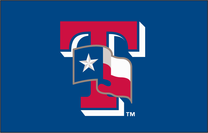 Used as the insignia on their BP caps from 2003-2006, I love the red T. The state flag makes it even better. I wish they would have used this as a in game cap, but I don't make the rules.
Toronto Blue Jays:
 Let the trolling begin. Would all haters please form an orderly line to leave comments, but before you put that 36th exclamation point on that three page comment, hear me out. The Jays switched to an awesome primary this year & most baseball fans are worshiping it like it's the second coming of Christ. I actually like the old Jays primary better then the current, just for reference. This maple leaf was used as the sleeve logo from 2009-2011. There's just something I like about this leaf. It may be the blue outline, maybe it's the grey outer outline, I just think it looks better then the current primary.
Arizona Diamondbacks:
 This logo is awesome! Who made the decision to change to the desert colors, this looks way better! The purple & teal is unbeatable! Bring it back! Please! This last sentence isn't gonna have a exclamation point.
Atlanta Braves:
 This logo reminds me of the crossed ax logo most fire stations use. But this logo is so awesome! It's used as the sleeve logo on their Sunday jerseys, & it looks good. If I was the Braves owner, though, I'd take Atlanta off the bottom, & center Braves, then I'd replace 1876 with ATL. Otherwise however, it's a good logo, but I don't understand why it says 1876, the Braves were created in 1871 as the Boston Red Stockings, so why does it say '76?
Chicago Cubs:
 This logo is amazing. The red, white, & blue go together perfectly, & the giant C is awesome, this logo is the only thing good about the Cubs.
Cincinnati Reds:
 This logo is like the Cubs', but it's not as good, the REDS inside the C doesn't fit together as well, if their name was CREDS, this would almost be equal to to the Cubs'. The Chicago Bears style C doesn't look as good red as well. The Reds have tried this in blue & black but even though those two variants have good color combination, it just doesn't work.
Colorado Rockies:
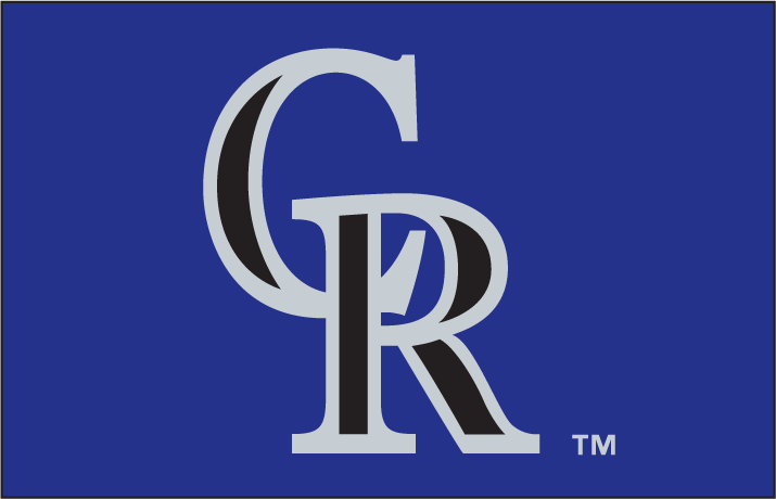 The Rockies have never been that good at making logos, & this one could be better. They could have interlocked the C & R better, or written it in a more unique font, but the neon purple back ground looks good, & the grey letters are just fine.
Houston Astros:
 The Astros have never had very good logos, but that ended with this one, the font that Astros is written in is cool, & the star looks amazing. But, sadly, the Astros will probably change their jerseys when they switch to the AL, meaning this cool logo might disappear. Hopefully, they'll keep the star in some form. Maybe.
LA Dodgers:
 This logo is pretty cool. The silver outline with the light blue LA is awesome, the Dodgers don't use this anymore, but they do use one that looks like it on their cap insignia. Great job LA, keep up the good work.
Miami Marlins:
 This one was actually in a close battle with this for the best Marlins logo ever. I really don't understand why people don't like the new Marlins logo set & jerseys. I think they look great. They're so colorful & pretty, all the bright colors make it look awesome. This isn't their primary, it's the alt cap insignia.
Milwaukee Brewers:
 Why was this ever replaced?! It's awesome! Putting a M & B together to make a baseball glove is genius! Why was this every changed? Bring it back!
New York Mets:
 I hate the Mets, & in my mind, they can never have a good logo. But this one looks better then the primary.
Philadelphia Phillies:
 Only the Phillies can use the generic cursive front & make it look good. The blue back ground with the red & white ball is simply amazing. the blue stars also add coolness factor.
Pittsburgh Pirates:
 Pittsburgh has one of the best cap insignias in the league, & adding the circle makes it way better. Once again, always add a circle.
San Diego Padres:
 A lot of people like the Padres old logo, I'm not one of them. This logo is way better & should be used forever. Take the painfully average SD cap insignia & put the circle around it, makes it better. See, it can make even the normaliest logos look better.
San Francisco Giants:
 Maybe it's because I'm a Florida State fan, but I've always liked the Giants SF logo, may because it's very similar to FSU's FS logo. What ever it is, this is a very good logo, & if I were the Giants I'd strongly consider making this the primary.
St. Louis Cardinals:
 Like the Tigers, the Cardinals have a very good road cap insignia, & should wear it at home. The thing I like about this logo is that it's made up of three letters, not the normal one or two. The red letters with white outline plus navy back ground is a very good combination.
Washington Nationals:
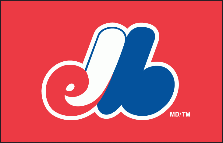 This was used as the BP insignia in the Expos final years in Montreal. The old expos logo is way better than any Nationals logo. The way the e & b come together to form an M on a red back ground is amazing. When you first look at it, you can't tell what it is to save your life, then you read on sportslogos.net that it's a eMb, you love it. As you can probably tell, e stands for Expos, M for Monteal, & b for baseball. I really hope one day the MLB give Montreal a second chance, as long as they can have their old logo set back. They had some of the best logos & jerseys in the MLB. Maybe when the MLB decides to expand again in 20 years, Montreal will win.
All logos from Cris Creamer's sportslogos.net
Boston Red Sox:

Chicago White Sox:

Cleveland Indians:

Detroit Tigers:

Kansas City Royals:

LA Angels:

Minnesota Twins:
New York Yankees:
Oakland Athletics:

Seattle Mariners:
Tampa Bay Rays:
Texas Rangers:
Toronto Blue Jays:
Arizona Diamondbacks:
Atlanta Braves:

Chicago Cubs:

Cincinnati Reds:

Colorado Rockies:
Houston Astros:

LA Dodgers:
Miami Marlins:
Milwaukee Brewers:
New York Mets:


Pittsburgh Pirates:

San Diego Padres:

San Francisco Giants:

St. Louis Cardinals:

Washington Nationals:
All logos from Cris Creamer's sportslogos.net
No comments:
Post a Comment