
With the Astros moving to the AL in 2013, they'll be changing their uniforms completely. Owner Jim Crane says the 'Stros will be using "traditional" designs based off past & the current uniforms to make a "classy" new uniform. The new logos & uniforms will no doubt be orange & blue, but what else? Crane says the new primary will be like the Nationals' & Padres', which means it will be the cap insignia inside the circle of epicness, that's good. I'm one of the few people who like the current Astros logo set & uniforms, but I'm sure the new uniforms & logos will be better. Houston's always been one of the better logoed teams out there, & each new 'Stros uniform has been better the the one before it, so combining all of them would make the best uniform ever, right? There are a few things I hope they keep, & I'll tell you what they are now. The thing I hope they keep the most is the open star, even though I really don't understand it, it still looks really cool. Another thing they need to keep, or put back, is the rainbow. It looks really cool, it has all the fun of a gradient, without the annoying gradients-don't-belong-in-sports people. The finally thing they need is the shooting star, the one in the 50th season logo. I just like the way it looks. With all that said I'm now gonna rank the top five new Astros uniform concepts on the internet, so let's go!
1.
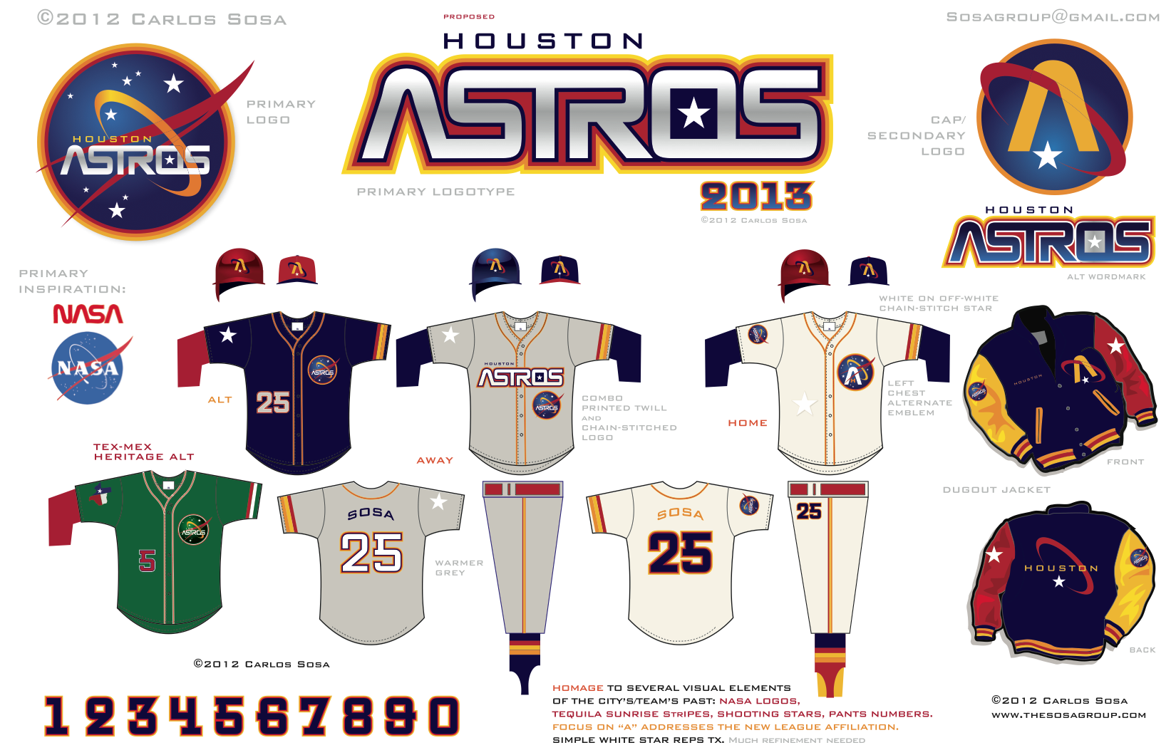
I really like this one a lot for a few reasons. Mainly because it has everything I wanted. The cap insignia stayed with the open star. This new one is even better than
the current. It also has the rainbow. Finally, it has the shooting star. This uniform is probably the closest you can get to the actual, it's orange & blue, classy, & is a mix of the old & new. Big credit goes to the guy who made this, maybe Crane will get lazy & just use these.
2.
Let me remind you, these ARE NOT GONNA HAPPEN. They're not gonna happen for a few reasons, for one they're not a mix of anything, they're completely original—but that could be a good thing,—two, they're not classy, a classy uniform isn't extremely modern, but it's not too old school either. This uniform isn't even modern, it's predicting the style of the next century. I don't know why I like these, they don't have the open star, rainbow or shooting star. I guess the green alt just caught my eye, but these uniforms AREN'T GONNA HAPPEN.
3.
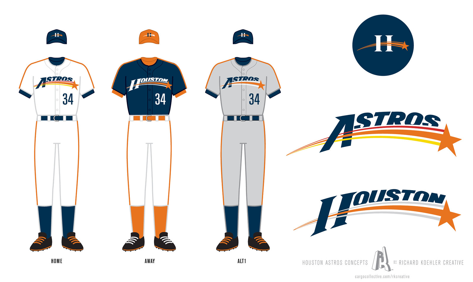
This uniform is cool, but it does have a few problems. It has the open star & rainbow, but no shooting star. Another problem is the open star itself, it's just the current one recolored. Don't get me wrong the current one is good, but could be better. This one is cool, but not up to par with the standards the 1st one sets.
4.
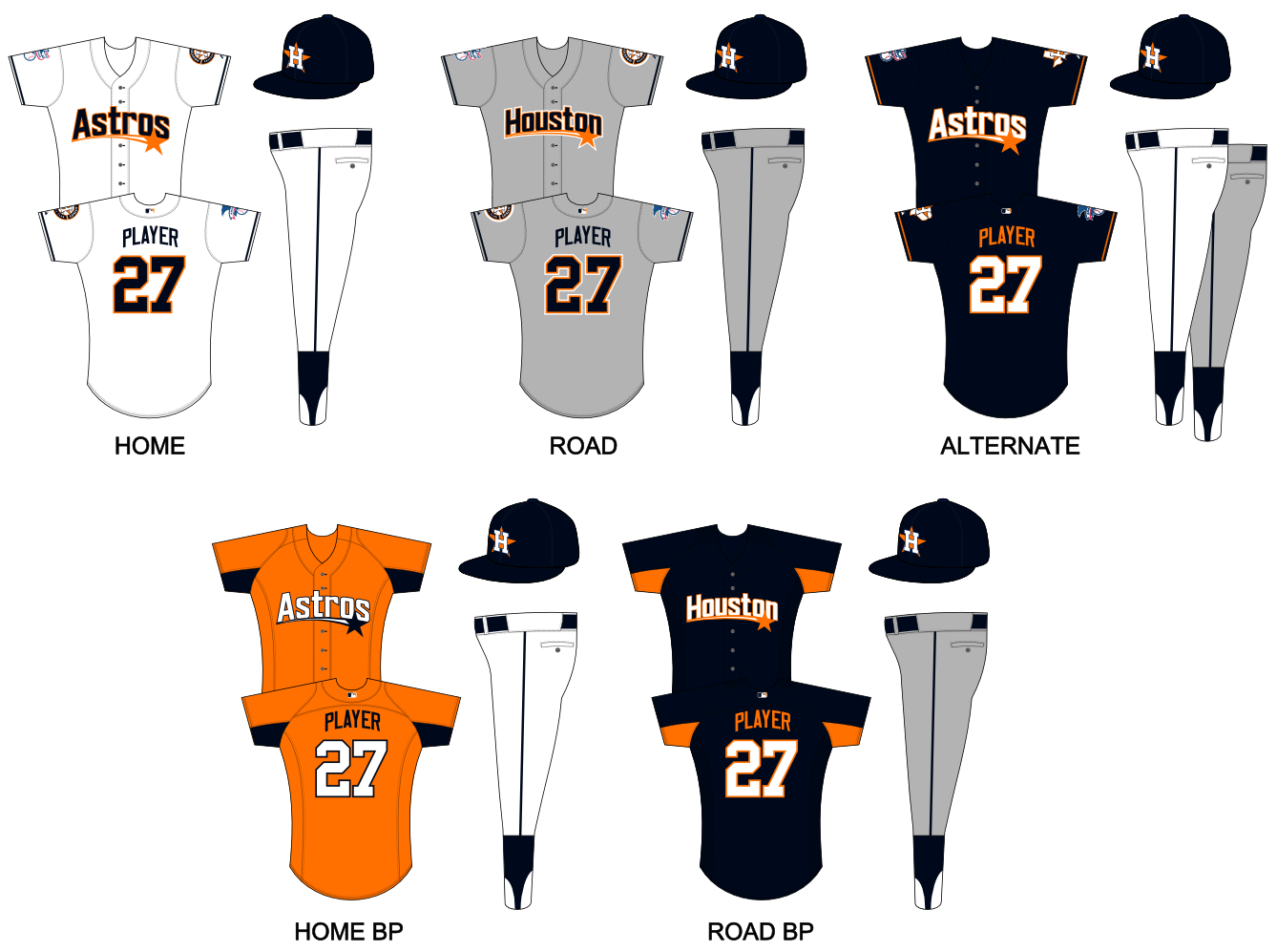
This one has a few problems as well, it has the shooting star, but no rainbow or open star. The orange is fine, but I don't like the shade of blue used. The H-on-a-star cap insignia is fine, but not near as good as the open star. This one is possible, but it doesn't have anything in common with the current, so it's probably not gonna happen.
5.
These are cool, but not that good. the rainbow & shooting star are kinda there, they're combined, but no open star. I do like the the alt, the orange cap looks cool. The fact the the alt says Houston & the away says Astros confuses me, but who cares. These are like #4, they're cool, but don't combing enough to be used.

No comments:
Post a Comment